# Code for the project 2025 and the blog post on health expenditure and outcomes
# Author: Aurélien Sallin
# Date: January 2026
# This code is different than the one used for the official solution, because
# it is adapted for the blog post.
# CHAPTER 0 ---------------------------------
# Load required libraries
library(dplyr)
library(tidyverse)
library(summarytools)
library(ggplot2)
library(qs)
library(ggrepel)
library(WDI)
library(OECD)
# Set flag to download and process data or read from cache
download_and_process <- FALSE
# CHAPTER 1 ---------------------------------
# Chapter 1: Search for health expenditure indicators,
# Download and preprocess World Bank health data
# Search for relevant indicators related to health expenditure from the World Bank database
indicators <- WDIsearch("health expenditure")
head(indicators, 10) # Display the first 10 results
if (download_and_process) {
# Download and preprocess World Bank health data
df_WorldBank_health <- WDI(
country = "all",
indicator = c(
"ind_WorldBank_health_gdp" = "SH.XPD.CHEX.GD.ZS", # Health expenditure as % of GDP
"ind_WorldBank_health_usd" = "SH.XPD.CHEX.PC.CD", # Health expenditure per capita (current US$)
"ind_WorldBank_health_pp" = "SH.XPD.CHEX.PP.CD", # Health expenditure per capita (PPP)
"ind_WorldBank_lifeexpectancy" = "SP.DYN.LE00.IN" # Life expectancy at birth (years)
),
start = 2000,
end = 2024,
extra = TRUE
) |>
as_tibble()
# Remove aggregate regions from the dataset
df_WorldBank_health <- df_WorldBank_health |>
filter(region != "Aggregates")
# Select relevant variables and clean the dataset
df_WorldBank_health <- df_WorldBank_health |>
select(
iso3c, year, income, country,
ind_WorldBank_health_gdp, ind_WorldBank_health_usd, ind_WorldBank_health_pp, ind_WorldBank_lifeexpectancy
) |>
filter(iso3c != "") |>
rename(
country = iso3c,
country_name = country
)
# Explore countries with NA: many are high income
na_table <- df_WorldBank_health |>
group_by(income, country_name, country) |>
summarise(
number_years = n_distinct(year),
na_gdp = sum(is.na(ind_WorldBank_health_gdp)),
na_usd = sum(is.na(ind_WorldBank_health_usd)),
na_pp = sum(is.na(ind_WorldBank_health_pp)),
na_le = sum(is.na(ind_WorldBank_lifeexpectancy))
) |>
filter(na_gdp > 0 | na_usd > 0 | na_pp > 0 | na_le > 0)
na_table
# Save data in cache as .qs
qsave(df_WorldBank_health, "Project_dh2025/data/wb_health.qs")
}
# CHAPTER 3 ---------------------------------
# Chapter 3: Download and preprocess OECD health status data
# Perceived health status
if (download_and_process) {
# Download and preprocess OECD health status data
dataset_id_phs <- "OECD.ELS.HD,DSD_HEALTH_STAT@DF_PHS,1.0"
df_oecd_phs <- get_dataset(
dataset_id_phs,
start_time = 2000,
end_time = 2024
)
# Filter for perceived health status
df_oecd_phs <- df_oecd_phs |>
filter(SEX == "_T") |> # all genders
filter(AGE == "Y_GE15") |> # aged 15 years old and over
filter(HEALTH_STATUS == "G") # who report their health to be ‘good/very good' (or excellent)
# We also focus on non-defined Socio-econ status
df_oecd_phs <- df_oecd_phs |>
filter(SOCIO_ECON_STATUS == "_Z")
# Keep the relevant variables and values
df_oecd_phs <- df_oecd_phs |>
mutate(
TIME_PERIOD = as.integer(TIME_PERIOD),
ObsValue = as.numeric(ObsValue)
) |>
select(REF_AREA, TIME_PERIOD, ObsValue) |>
rename(
country = REF_AREA,
year = TIME_PERIOD,
health_status_oecd = ObsValue
)
# Save data in cache
qsave(df_oecd_phs, "Project_dh2025/data/oecd_phs.qs")
}
if (!download_and_process) {
df_WorldBank_health <- qread("Project_dh2025/data/wb_health.qs")
df_oecd_phs <- qread("Project_dh2025/data/oecd_phs.qs")
}
# CHAPTER 4 ---------------------------------
# Chapter 4: Merge World Bank and OECD datasets
# Merge datasets
df_final <- df_WorldBank_health |>
full_join(df_oecd_phs, by = c("country", "year"))
# Transform income groups to factors:
income_groups <- c("Low income", "Lower middle income", "Upper middle income", "High income")
df_final <- df_final |>
mutate(income = factor(income, levels = income_groups))
# CHAPTER 5 ---------------------------------
# Chapter 5: Analyze and visualize health expenditure trends
df_final |>
pivot_longer(
cols = c(
ind_WorldBank_health_gdp,
ind_WorldBank_health_usd,
ind_WorldBank_health_pp
),
values_to = "value",
names_to = "indicator"
) |>
group_by(year, indicator) |>
summarise(ind_year = mean(value, na.rm = TRUE), .groups = "drop") |>
mutate(
# Transform GDP values to percentage for labeling
formatted_value = case_when(
indicator == "ind_WorldBank_health_gdp" ~ ind_year,
TRUE ~ ind_year
)
) |>
ggplot(aes(x = year, y = formatted_value, color = indicator)) +
geom_line(linewidth = 1.2) +
facet_wrap(
~indicator,
ncol = 1,
scales = "free_y",
labeller = labeller(
indicator = c(
ind_WorldBank_health_gdp = "Health expenditure (% of GDP)",
ind_WorldBank_health_usd = "Health expenditure per capita (USD)",
ind_WorldBank_health_pp = "Health expenditure per capita (PPP)"
)
)
) +
scale_color_manual(
values = c(
ind_WorldBank_health_gdp = "#0072B2",
ind_WorldBank_health_usd = "#009E73",
ind_WorldBank_health_pp = "#D55E00"
),
guide = "none"
) +
scale_y_continuous(
labels = function(x) {
# Check if this is the GDP facet (smaller values) and add % signs
if (length(x) > 0 && max(x, na.rm = TRUE) < 15) {
paste0(round(x), "%")
} else {
as.character(round(x))
}
}
) +
expand_limits(y = 0) +
labs(
title = "Health expenditure over time",
subtitle = "Different measurement concepts shown separately",
x = "Year",
y = NULL
) +
theme_classic() +
theme(
strip.background = element_blank(),
strip.text = element_text(size = 11, angle = 0, hjust = 0, face = "bold"),
legend.position = "bottom",
plot.title = element_text(size = 14),
plot.subtitle = element_text(size = 11),
panel.grid.major.x = element_line(color = "grey90", linewidth = 0.3)
)
df_gdp <- df_final |>
filter(!is.na(income)) |>
filter(year == 2022) |>
select(year, country, income, ind_WorldBank_health_gdp) |>
group_by(year, income) |>
summarise(
ind_WorldBank_health_pp = mean(ind_WorldBank_health_gdp, na.rm = TRUE),
.groups = "drop"
)
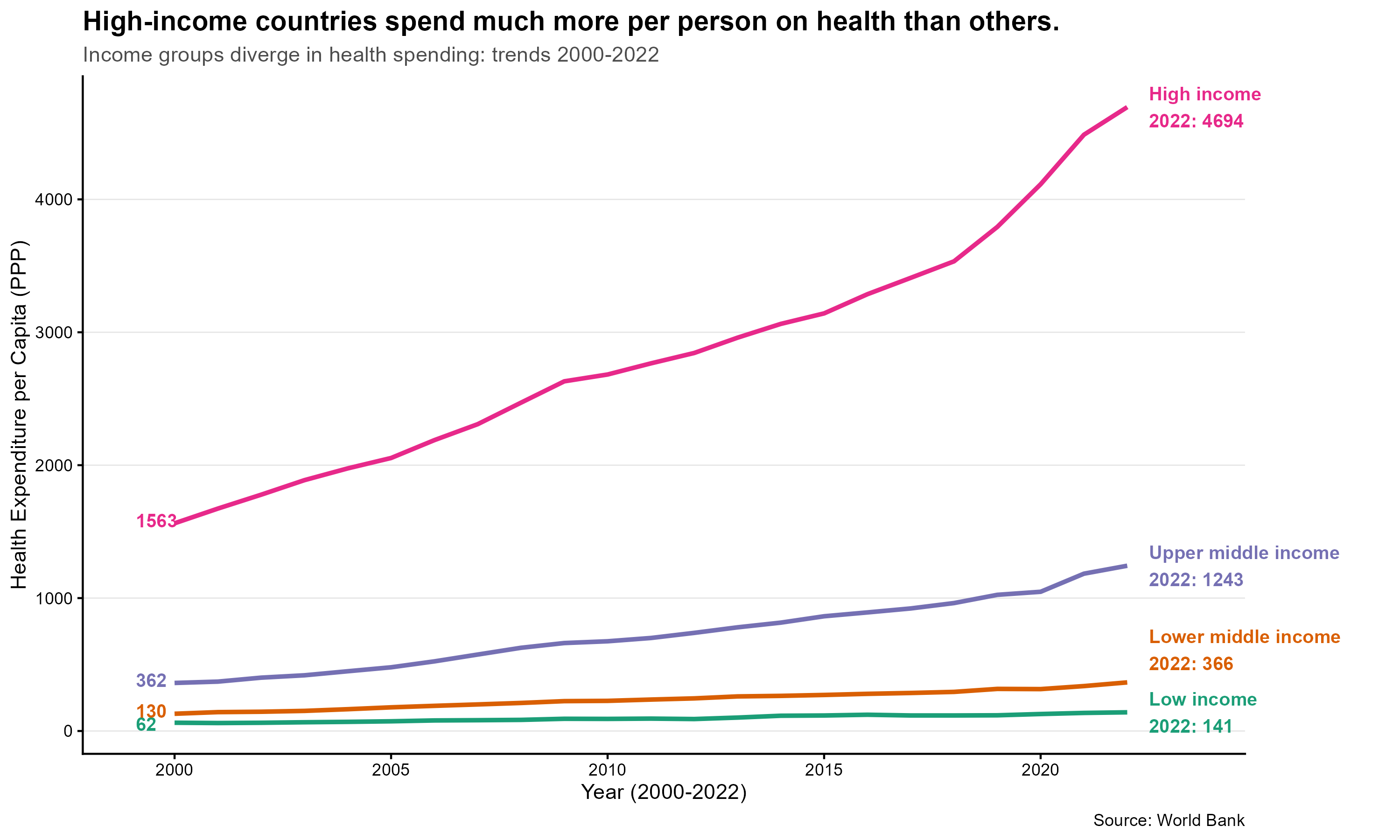
# Graph 1 for blog
# Add group label and value at the end of each line (RHS), remove legend
df_plot <- df_final |>
filter(!is.na(income)) |>
filter(year >= 2000 & year <= 2022) |>
select(year, country, income, ind_WorldBank_health_pp) |>
group_by(year, income) |>
summarise(
ind_WorldBank_health_pp = mean(ind_WorldBank_health_pp, na.rm = TRUE),
.groups = "drop"
)
ggplot(
df_plot,
aes(
x = year,
y = ind_WorldBank_health_pp,
color = income,
group = income
)
) +
geom_line(linewidth = 1.1) +
# Use a friendly qualitative palette for income groups
scale_color_brewer(palette = "Dark2") +
# Label at the end (RHS) with group and value
geom_text(
data = group_by(df_plot, income) |>
filter(year == 2022) |>
mutate(vjust = if_else(income == "Lower middle income", -0.3, 0.5)),
aes(
label = paste0(income, "\n2022: ", round(ind_WorldBank_health_pp, 0)),
x = year + 0.5,
y = ind_WorldBank_health_pp,
color = income,
vjust = vjust
),
hjust = 0,
size = 3.4,
fontface = "bold",
show.legend = FALSE
) +
# Number at the start (LHS)
geom_text(
data = group_by(df_plot, income) |>
filter(year == min(year)) |>
mutate(vjust = if_else(income == "Low income", 0.6, 0.3)),
aes(
label = paste0("", round(ind_WorldBank_health_pp, 0)),
x = year - 0.9,
y = ind_WorldBank_health_pp,
color = income,
vjust = vjust,
),
hjust = 0,
size = 3.4,
fontface = "bold",
show.legend = FALSE
) +
scale_y_continuous() +
scale_color_brewer(palette = "Dark2") +
# Ensure there is horizontal space for labels on the right and allow drawing outside panel
expand_limits(x = max(df_plot$year, na.rm = TRUE) + 1.5) +
coord_cartesian(clip = "off") +
labs(
subtitle = "Income groups diverge in health spending: trends 2000-2022",
title = "High-income countries spend much more per person on health than others.",
x = "Year (2000-2022)",
y = "Health Expenditure per Capita (PPP)",
caption = "Source: World Bank"
) +
theme_classic() +
theme(
strip.background = element_blank(),
strip.text = element_text(size = 11, angle = 0, hjust = 0, face = "bold"),
legend.position = "none",
plot.title = element_text(size = 14, face = "bold"),
plot.subtitle = element_text(size = 11, color = "grey30"),
panel.grid.major.y = element_line(color = "grey90", linewidth = 0.3),
plot.margin = margin(5.5, 80, 5.5, 5.5) # increase right margin so RHS labels are visible
)
# Save the faceted expenditure plot for the blog (wide, transparent PNG)
# Assign plot to object and export
ggsave(
filename = "Project_dh2025/figures/health_expenditure_time.png",
plot = last_plot(),
width = 10,
height = 6,
units = "in",
dpi = 300,
bg = "transparent"
)
# Create data for income group analysis
data_income_groups <- df_final |>
filter(income %in% income_groups) |>
group_by(year, income) |>
summarise(
health_gdp = mean(ind_WorldBank_health_gdp, na.rm = TRUE),
health_pp = mean(ind_WorldBank_health_pp, na.rm = TRUE),
health_usd = mean(ind_WorldBank_health_usd, na.rm = TRUE),
.groups = "drop"
) |>
pivot_longer(
cols = c(health_gdp, health_usd, health_pp),
names_to = "indicator",
values_to = "value"
)
# CHAPTER 6 ---------------------------------
# Chapter 6: Analyze health expenditure statistics by income group
data_income_groups <- df_final |>
filter(income %in% income_groups) |>
filter(year >= 2000 & year <= 2022) |>
group_by(year, income) |>
summarise(
ind_WorldBank_health_gdp_mean = mean(ind_WorldBank_health_gdp, na.rm = T),
ind_WorldBank_health_gdp_sd = sd(ind_WorldBank_health_gdp, na.rm = T),
ind_WorldBank_health_gdp_coeffvar = sd(ind_WorldBank_health_gdp, na.rm = T) / mean(ind_WorldBank_health_gdp, na.rm = T),
ind_WorldBank_health_usd_mean = mean(ind_WorldBank_health_usd, na.rm = T),
ind_WorldBank_health_usd_sd = sd(ind_WorldBank_health_usd, na.rm = T),
ind_WorldBank_health_usd_coeffvar = sd(ind_WorldBank_health_usd, na.rm = T) / mean(ind_WorldBank_health_usd, na.rm = T),
ind_WorldBank_health_ppp_mean = mean(ind_WorldBank_health_pp, na.rm = T),
ind_WorldBank_health_ppp_sd = sd(ind_WorldBank_health_pp, na.rm = T),
ind_WorldBank_health_ppp_coeffvar = sd(ind_WorldBank_health_pp, na.rm = T) / mean(ind_WorldBank_health_usd, na.rm = T)
)
# Plot expenditure by income group
data_income_groups |>
ggplot(aes(x = year, y = ind_WorldBank_health_usd_mean, color = income)) +
geom_line(linewidth = 1.2) +
labs(
title = "Health expenditure per capita by income group",
x = "Year",
y = "Health expenditure per capita (current US$)",
color = "Income group",
caption = "Source: World Bank"
) +
theme_minimal()
# Plot expenditure by income group
data_income_groups |>
ggplot(aes(x = year, y = ind_WorldBank_health_gdp_mean, color = income)) +
geom_line(linewidth = 1.2) +
labs(
title = "Health expenditure (% of GDP) by income group",
x = "Year",
y = "Health expenditure per capita (% of GDP)",
color = "Income group",
caption = "Source: World Bank"
) +
theme_minimal()
# Plot expenditure by income group
data_income_groups |>
ggplot(aes(x = year, y = ind_WorldBank_health_ppp_mean, color = income)) +
geom_line(linewidth = 1.2) +
labs(
title = "Health expenditure per capita by income group",
x = "Year",
y = "Health expenditure per capita (PPP)",
color = "Income group",
caption = "Source: World Bank"
) +
theme_minimal()
# CHAPTER 7 ---------------------------------
# Chapter 7: Analyze and visualize life expectancy trends
## Life expectancy by income group: styled for blog
# Compute yearly averages by income group (2000-2022)
df_le_plot <- df_final |>
filter(income %in% income_groups) |>
filter(year >= 2000 & year <= 2022) |>
group_by(year, income) |>
summarise(
ind_WorldBank_lifeexpectancy = mean(ind_WorldBank_lifeexpectancy, na.rm = TRUE),
.groups = "drop"
)
ggplot(df_le_plot, aes(x = year, y = ind_WorldBank_lifeexpectancy, color = income, group = income)) +
geom_line(linewidth = 1) +
# RHS label with group name and 2022 value
geom_text(
data = df_le_plot %>% group_by(income) %>% filter(year == max(year)),
aes(
label = paste0(income, "\n2022: ", round(ind_WorldBank_lifeexpectancy, 1)),
x = year + 0.5
),
hjust = 0,
vjust = 0.5,
size = 3.4,
fontface = "bold",
show.legend = FALSE
) +
# LHS label with 2000 value
geom_text(
data = df_le_plot %>% group_by(income) %>% filter(year == min(year)),
aes(
label = paste0(round(ind_WorldBank_lifeexpectancy, 1)),
x = year - 0.1
),
hjust = 1, vjust = 0.5, size = 3.4, fontface = "bold", show.legend = FALSE
) +
scale_y_continuous(limits = c(50, 81)) +
scale_color_brewer(palette = "Dark2") +
# allow labels outside plotting area and give room on the right
expand_limits(x = max(df_le_plot$year, na.rm = TRUE) + 1.5) +
coord_cartesian(clip = "off") +
labs(
subtitle = "Life expectancy increased across all groups (2000–2022); lower-income groups saw faster gains.",
title = "Average life expectancy rose faster in lower-income groups, but gaps persist.",
x = "Year",
y = "Life expectancy at birth (years)",
caption = "Source: World Bank"
) +
theme_classic() +
theme(
legend.position = "none",
plot.title = element_text(size = 14, face = "bold"),
plot.subtitle = element_text(size = 11, color = "grey30"),
panel.grid.major.y = element_line(color = "grey90", linewidth = 0.3),
plot.margin = margin(5.5, 80, 5.5, 5.5)
)
# Save life-expectancy plot as wide transparent PNG for blog
ggsave(
filename = "Project_dh2025/figures/life_expectancy_income_groups.png",
plot = last_plot(),
width = 8,
height = 6,
units = "in",
dpi = 300,
bg = "transparent"
)
# CHAPTER 8 ---------------------------------
# Chapter 8: Analyze and visualize perceived health status trends
# 2, Health status
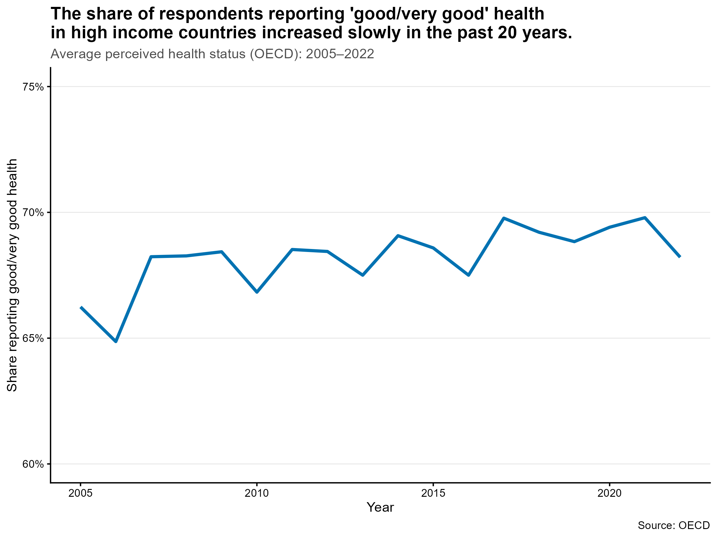
## OECD average perceived health status (styled for blog)
# Compute OECD average by year (2000-2022)
df_oecd_status <- df_final |>
filter(!is.na(health_status_oecd)) |>
filter(year >= 2005 & year <= 2022) |>
group_by(year) |>
summarise(
avg_health_status = mean(health_status_oecd, na.rm = TRUE),
.groups = "drop"
)
ggplot(df_oecd_status, aes(x = year, y = avg_health_status)) +
geom_line(size = 1.2, color = "#0072B2") +
scale_y_continuous(labels = scales::percent_format(accuracy = 1, scale = 1), lim = c(60, 75)) +
labs(
subtitle = "Average perceived health status (OECD): 2005–2022",
title = "The share of respondents reporting 'good/very good' health \nin high income countries increased slowly in the past 20 years.",
x = "Year",
y = "Share reporting good/very good health",
caption = "Source: OECD"
) +
theme_classic() +
theme(
legend.position = "none",
plot.title = element_text(size = 14, face = "bold"),
plot.subtitle = element_text(size = 11, color = "grey30"),
panel.grid.major.y = element_line(color = "grey90", linewidth = 0.3),
plot.margin = margin(5.5, 5.5, 5.5, 5.5)
)
# Save OECD health-status plot as wide transparent PNG for blog
ggsave(
filename = "Project_dh2025/figures/oecd_health_status_avg.png",
plot = last_plot(),
width = 8,
height = 6,
units = "in",
dpi = 300,
bg = "transparent"
)
# Health status per income group
df_final |>
group_by(year, income) |>
summarise(
avg_health_status = mean(health_status_oecd, na.rm = TRUE)
) |>
ggplot(aes(x = year, y = avg_health_status, color = income)) +
geom_line(size = 1.2) +
labs(
title = "Average Health Status Over Time ",
x = "Year",
y = "Share of people who report to be in good health"
) +
theme_minimal() +
theme(
legend.position = "right",
axis.text.x = element_text(angle = 45, hjust = 1)
)
# CHAPTER 9 ---------------------------------
# Chapter 9: Explore relationships between health expenditure and outcomes
# Example: Visualizing the relationship between spending and outcomes
df_final |>
filter(year == 2022) |>
filter(country_name != "Central African Republic") |> # remove outlier with very low spending and life expectancy
select(
income,
country,
country_name,
ind_WorldBank_health_usd,
ind_WorldBank_health_pp,
ind_WorldBank_lifeexpectancy
) |>
mutate(
label = if_else(
(ind_WorldBank_health_usd >
quantile(ind_WorldBank_health_usd, 0.9, na.rm = T) |
ind_WorldBank_health_usd <
quantile(ind_WorldBank_health_usd, 0.1, na.rm = T) |
ind_WorldBank_health_pp >
quantile(ind_WorldBank_health_pp, 0.9, na.rm = T) |
ind_WorldBank_health_pp <
quantile(ind_WorldBank_health_pp, 0.1, na.rm = T) |
ind_WorldBank_lifeexpectancy <
quantile(ind_WorldBank_lifeexpectancy, 0.1, na.rm = T) |
ind_WorldBank_lifeexpectancy >
quantile(ind_WorldBank_lifeexpectancy, 0.9, na.rm = T)) &
income %in% c("High income") &
country_name %in% c(
"Germany", "Finland", "Sweden", "Norway", "Italy", "Spain", "Portugal", "United Kingdom",
"Ireland", "Netherlands", "Poland", "Austria", "Belgium", "Denmark", "France",
"Greece", "Czech Republic", "Slovak Republic", "Hungary", "Luxembourg", "Iceland"
),
country_name,
NA_character_
)
) |>
ggplot(aes(
y = ind_WorldBank_lifeexpectancy,
x = ind_WorldBank_health_pp
)) +
geom_smooth(
method = "loess",
se = FALSE,
color = "grey50",
linetype = "dashed",
linewidth = 0.5
) +
geom_point(alpha = 0.75, color = "#0072B2", size = 1.5) +
scale_y_continuous(limits = c(0, 100)) +
# Label outliers but exclude US and Switzerland (they are highlighted separately)
geom_text_repel(
data = . %>%
filter(
!is.na(label) & !(country_name %in% c("United States", "Switzerland"))
),
aes(label = label),
size = 3,
color = "black",
segment.color = "grey80",
box.padding = 0.4,
max.overlaps = 20
) +
# Highlight US and Switzerland with red points
geom_point(
data = df_final %>%
filter(
year == 2022 & country_name %in% c("United States", "Switzerland")
),
aes(x = ind_WorldBank_health_pp, y = ind_WorldBank_lifeexpectancy),
color = "#D55E00",
size = 3.3
) +
# Highlight countries that illustrate the threshold effect
geom_text_repel(
data = df_final %>%
filter(year == 2022, country_name %in% c("United States", "Switzerland")),
aes(
x = ind_WorldBank_health_pp,
y = ind_WorldBank_lifeexpectancy,
label = country_name
),
color = "#D55E00",
size = 3.8,
fontface = "bold",
box.padding = 0.65,
direction = "y",
max.overlaps = 20,
segment.color = "grey50",
show.legend = FALSE
) +
labs(
title = "Twice the spending, same or lower life expectancy",
subtitle = "US and Switzerland spend about twice as much on health (PPP per capita, 2022) as \nother OECD countries with similar life expectancy",
x = "Health expenditure per capita (PPP)",
y = "Life Expectancy at Birth (years)",
caption = "Spending shown in PPP per capita (purchasing power parity: adjusted for price-level differences). \nSource: World Bank, 2022."
) +
theme_classic() +
theme(
plot.title = element_text(size = 14, face = "bold"),
plot.subtitle = element_text(size = 11, color = "grey30"),
panel.grid.major.y = element_line(color = "grey90", linewidth = 0.3),
plot.margin = margin(5.5, 5.5, 5.5, 5.5)
)
# Save scatter for blog (wide transparent PNG)
ggsave(
filename = "Project_dh2025/figures/spending_vs_life_2022.svg",
plot = last_plot(),
width = 8,
height = 6,
units = "in",
dpi = 300,
bg = "transparent"
)
# Save scatter for linkedin
ggsave(
filename = "Project_dh2025/figures/spending_vs_life_2022_ln.png",
plot = last_plot(),
width = 7.5,
height = 5.5,
units = "in",
dpi = 300,
bg = "transparent"
)
# Example: Comparing perceived health status
df_final |>
# filter(year == 2019) |>
ggplot(aes(x = ind_WorldBank_health_pp, y = health_status_oecd)) +
geom_point() +
labs(
title = "Perceived Health Status by Country",
x = "Healthcare Spending per Capita (PP)",
y = "Perceived Health Status (%)"
)
# End of code